Table of Contents
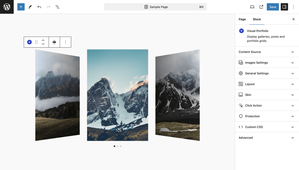
The Slider layout is designed to show your gallery items in a slider and carousel view, perfect for interactive displays.
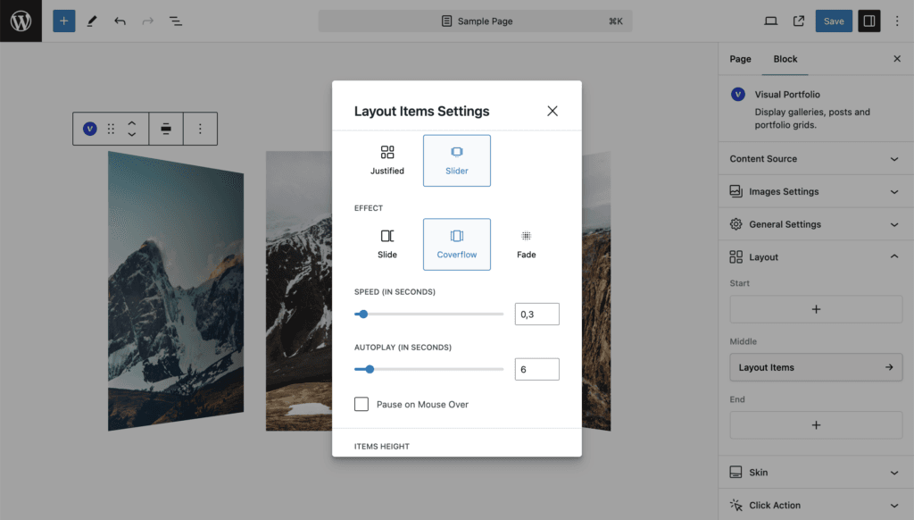
Available Settings
- Effect – Choose from three carousel effects: Slide, Coverflow, and Fade.
- Speed (in Seconds) – Adjust this value to set the duration of the effect while changing a slide.
- Autoplay (in Seconds) – Set the interval for changing slides. Set to zero to turn off the autoplay feature.
- Pause on Mouse Over – Stop autoplay when you hover over items.
- Items Height
- Auto – Display images in their original aspect ratio.
- Static (px) – Set the height of the slides in pixels for a fixed height.
- Dynamic (%) – Set the height of the slides in percentage, allowing the height to change depending on the size of the browser window.
- Items Minimal Height – Set the minimum height. For a fullscreen carousel, type
100vhto make it 100% of the screen height. - Slides Per View (not available with Fade skin)
- Auto – Slide width is calculated automatically, and the dynamic height is counted from the width of the carousel.
- Custom – Set the number of slides visible on the screen at the same time.
- Centered Slides (not available with Fade skin) – Display the active gallery item centered. If not selected, the active carousel will be on the left side.
- Loop – Enable looping your carousel so it does not have an end.
- Free Scroll – Make slides not have fixed positions while sliding manually.
- Display Arrows – Show arrows for carousel navigation.
- Display Bullets – Show bullets for carousel navigation, appearing below the carousel by default.
- Dynamic Bullets – Show bullets only for the slides currently shown on the page.
- Mousewheel Control – Scroll your carousel using the mousewheel.
- Display Thumbnails – Show thumbnails of slides for carousel navigation.
- These settings are the same as for the normal carousel (described below).
- Gap – Set the spacing between slides.
Effect
Choose from three carousel effects:
- Slide: Standard sliding transition.
- Coverflow: 3D-like effect where slides overlap.
- Fade: Smooth fade transition between slides.
Speed and Autoplay
- Speed: Set the duration of the transition effect in seconds.
- Autoplay: Set the interval between slide changes. Set to 0 to disable autoplay.
- Pause on Mouse Over: Toggle this option to pause autoplay when the user hovers over the slider.
Items Height
Choose how to set the height of your slider items:
- Auto: Uses the original aspect ratio of your images.
- Static (px): Set a fixed height in pixels.
- Dynamic (%): Set a percentage height relative to the slider’s width.
Items Minimal Height allows you to set a minimum height, useful for responsive designs.
Slides Per View
- Auto: Automatically calculates the number of visible slides.
- Custom: Manually set the number of slides visible at once.
Centered Slides option centers the active slide when enabled.
Navigation Options
- Loop: Enable to make the slider loop continuously.
- Free Scroll: Allow free scrolling without snapping to slides.
- Display Arrows: Show navigation arrows.
- Display Bullets: Show navigation bullets.
- Dynamic Bullets: Only show bullets for visible slides.
- Mousewheel Control: Enable scrolling the slider with the mousewheel.
- Display Thumbnails: Show thumbnail navigation.
Gap
Set the spacing between slides using the Gap setting.